Share this story
EdNC’s Consider It Mapped is back with a map of the most recent school performance grades, released by the NC Department of Public Instruction (DPI) in September. Since grades were last reported in 2018-19, the pandemic happened, and the overall 2021-22 visualizations of As, Bs, Cs, Ds, and Fs reflects this disruption in learning. This map was designed to allow you to envision alternative approaches to grading by changing the growth score weight. Click here if viewing on a tablet and here if viewing on mobile.
A refresher on the maps and data
Since it has been awhile, here is a quick primer explaining the school grading system in North Carolina:
- NC DPI reports school performance grades annually. Reporting of A-F letter grades began in 2013-14.
- Academic achievement, including measures of student progress like test scores (ex. End-of-Grade, End-of-Course, and ACT test results), graduation rates, and measures of work readiness, makes up 80% of a school’s grade. School growth, measured by the extent to which students met or exceeded the state’s performance expectations for that school for that year, makes up the other 20%. The formula is set by legislation passed by the N.C. General Assembly.
- NC DPI reports grades on a 15-point scale. Original legislation was written with the intent to establish a 10-point grading scale, but in 2019, lawmakers made the 15-point grading scale permanent with Session Law 2019-154 (Section I).
Here you can find more information about school performance grades, including the executive summary, the annual testing report, the background brief on the accountability framework, and the communication webinar.
2021-22 visualizations
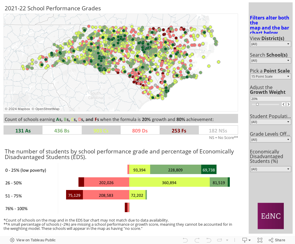
This year’s visuals include familiar fixtures, like the map of all school grades and the diverging bar chart showing the number of students in schools earning each grade crossed with the percentage of economically disadvantaged students in each school. Users can drill down to examine districts, schools, and patterns in the data based on the characteristic filters on the right side of the visualizations (or at the top if viewing the visualizations on mobile).
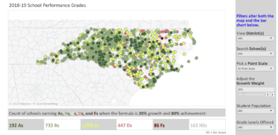
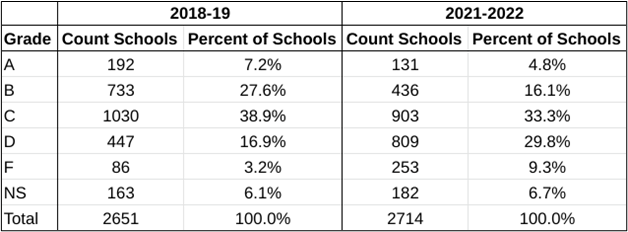
As I was updating the maps and running data quality checks, I noticed that the grade distribution was very different from the distribution that NC DPI reported in 2018-19. Where the 2018-19 school year saw heavy weighting toward Bs and Cs, the 2021-22 school year saw a shift to Cs and Ds. While the proportion of As and Bs fell by a little less than 50% in the 2021-2022 school year as compared with 2018-19, the proportion of Ds nearly doubled, and Fs nearly tripled.
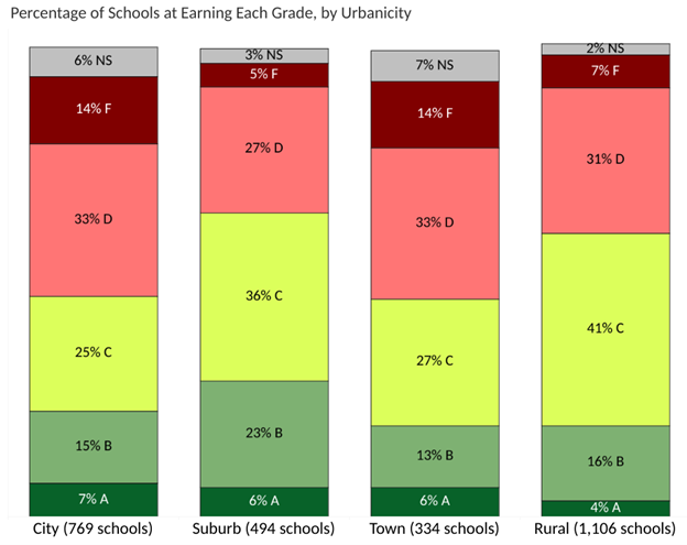
The prevalence of Cs and Ds is also apparent in the bar chart that shows grade distribution by urbanicity, which shows the distribution of schools in each geographic area by school performance grade. Please note that the bar segments add up to more than 100% in the rural category due to rounding.
What surprised me when further examining the distributional shifts by percentage of economically disadvantaged students was that it was difficult to distinguish a pattern. In many cases, the grade distribution among schools with a high percentage of economically disadvantaged students was impacted in a similar way to the grade distribution among schools with a low percentage of economically disadvantaged students.
The school performance grades are an indicator of the continuing impacts of COVID-19 on our schools. As in-person schooling returns and consistency again becomes the norm, we may see shifts in the grade distribution again towards higher grades, possibly as early as the next release for 2022-23. Time will tell if a year of “normal” will reset the grades to the pre-pandemic distributions or if the impacts of COVID-19 on schools will be longer-lasting.
What’s next
As we’ve highlighted over the years, the debate over how schools in North Carolina should be evaluated is constantly evolving. NC DPI has convened an advisory group to reconsider the school accountability model. The aim of this group is to develop a multi-measure model that goes beyond federal reporting guidelines to serve as a true reflection of school quality, a model that could be proposed to the N.C. General Assembly in 2023.
Consider It Mapped over the years
As you consider possible school accountability models, here are our maps from over the years.
Here is the first Consider It Mapped for 2013-14. Our questions early on included:
- Are school scores related in any way to differences in the affluence of their communities, and, if so, should these differences be factored into the overall grades?
- Are there other ways to measure growth beyond using high-stakes testing progress from year to year?
- What other factors should be included in the overall school grades?
Here is our Consider It Mapped for 2014-15.
Here is our Consider It Mapped for 2015-16. This map allows you to compare the first three years of letter grades.
Here is our Consider It Mapped for 2017-18. This year the way that DPI calculated grades changed. Comparisons to earlier years may provide prospective but don’t assume a one-to-one relationship regarding increases or decreases in school grades.
Here is our Consider It Mapped for 2018-19.

Recommended reading