Now that we’ve gotten to know each other and I settle into month nine of Consider It Mapped, I feel it’s important to confess: I am not an expert in the field of education.
As an undergraduate I majored in environmental studies and minored in mathematics, and then studied social policy and urban planning in graduate school. In between, in addition to some work in education, I focused primarily on environmental studies, health, and economics. These experiences have seemed somewhat disjointed to me at times, but they’ve taught me an important lesson: “interdisciplinary” isn’t just an empty term that’s used to sell a liberal arts degree; it’s how our world works, and mapping education data is proof.
The interdisciplinary nature of mapping really became clear to me last month when I began exploring data on child homelessness. In 2014, children accounted for 22 percent of all homeless people in North Carolina.1 Homelessness is an extreme housing condition experienced by a small percentage of North Carolina students, but it got me thinking about all of the other housing variables that also can contribute to instability in a child’s life, and how stable housing can contribute to a child’s success in school.
Many different housing factors can influence student education outcomes, and the research consensus is that less stability in housing leads to lower student achievement. Children who are homeless may have a harder time keeping up in school because they don’t have access to the necessary resources to continue their learning after school. Even if resources are available, lack of stable housing can mean that these children are in chaotic situations that are not conducive to learning when they leave school, which can have negative impacts on their grades and test scores.
Differences in housing quality also matter. Families in low-quality housing may be subject to more health problems as a result of living in unsafe conditions due to deterioration or poor construction. Safety concerns also extend beyond the home in neighborhoods with low-quality housing and high poverty; for instance, high-poverty neighborhoods often have higher incidences of violence and crime. Exacerbating the problem, lower-income housing is usually segregated, and lower-income neighborhoods are also often home to lower-quality schools.2
The uncertainty these housing conditions create is important as well. Families in neighborhoods characterized by low-quality housing often have trouble keeping up housing costs, which puts them at higher risk for eviction or foreclosure. These families are also at greater risk of being forced out of housing through rent increases, sometimes as a side effect of gentrification. In many of these cases, the end result is that the family has to move, which may force children to switch schools, break bonds with teachers, and, if they have to move frequently, fall behind in school.
Any one of these factors can lead to student learning difficulty, but some children have to deal with a combination of these factors. I wanted to look at these compounded housing factors in North Carolina by using maps and applying a technique I learned in environmental studies called site suitability analysis. This type of analysis involves combining a number of variables to determine the optimal area for locating a facility (sometimes a new business or hospital) or conducting an activity (like land preservation or logging). That may not sound applicable to problem-solving in education (unless we’re building a new school), but site suitability analysis is very flexible and has a number of non-traditional applications. I’ll explain first how it works, then demonstrate how I applied it to this month’s topic.
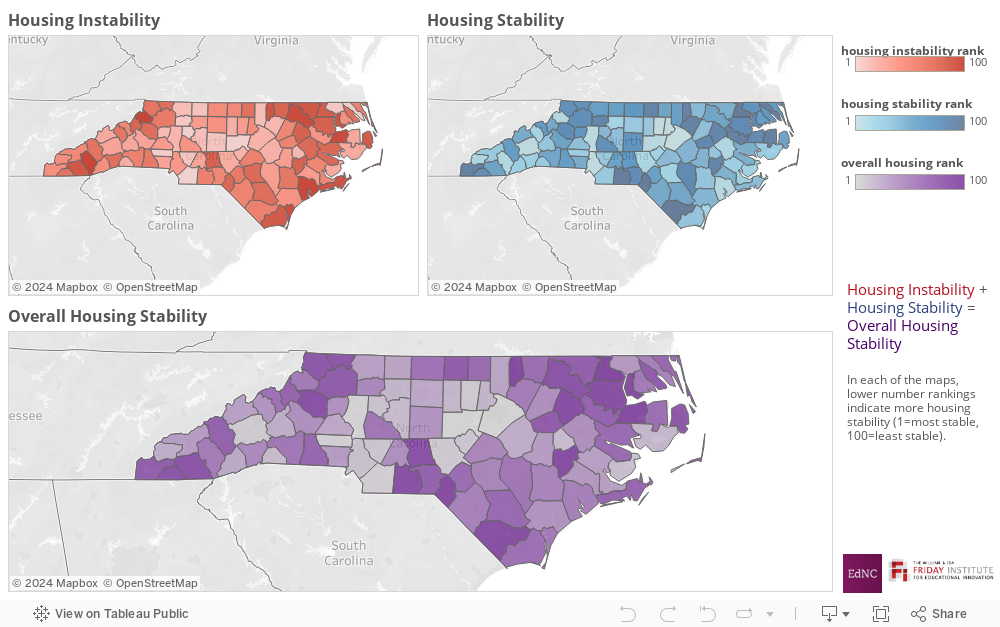
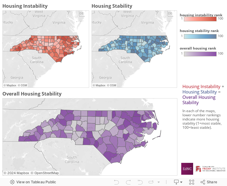
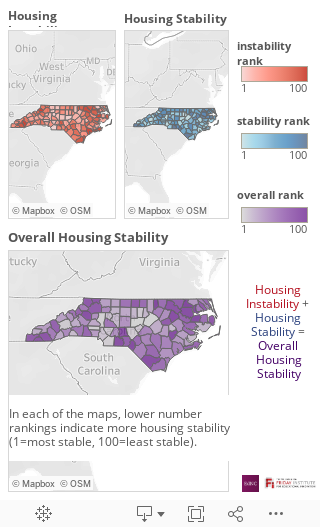
To determine site suitability, a mapmaker identifies a number of variables that are considered favorable for a proposed site and ranks each site from most to least suitable based on a composite score of all favorable variables. Then, the mapmaker takes a number of variables that are considered unfavorable and identifies the places with less suitable characteristics using the same process. Finally, the mapmaker combines the favorable and unfavorable measures to create a map of areas for consideration that have mostly favorable and little to no unfavorable attributes. Sound complicated? There are quite a few steps involved, but I think the concept will be easier to understand once I explain this month’s maps.
For my analysis, I thought of each county as a potential “site” for stable housing: Which counties were most suitably set up to provide stable housing for all residents? To analyze housing stability in North Carolina and look for patterns that might be consistent with education outcomes, I chose to look at five variables using 2014 Census data. Based on research on this topic, I chose percentage of homeowners in a given area (relative to renters) who are not cost-burdened (that is, those who spend 30 percent or less of their overall income on housing costs) and housing availability (measured here as the amount of diversity in housing price — the greater the spread in housing prices in a given area, the larger the housing market is for a wider income range of potential buyers) as indicators of housing stability. I included growth in housing stock in each county (measured by new construction since 2010) as a favorable indicator as well, because such growth typically indicates the “desirability” of an area.
I then looked at two measures of housing instability: percentage of renters who are cost-burdened (spending 30 percent or more of their income to cover housing costs); and percent of vacant properties. Vacancy was of interest because areas of high vacancy do not have a strong tax base for drawing revenue, which could impact area schools, and also because high vacancy has been linked to outcomes like higher crime.
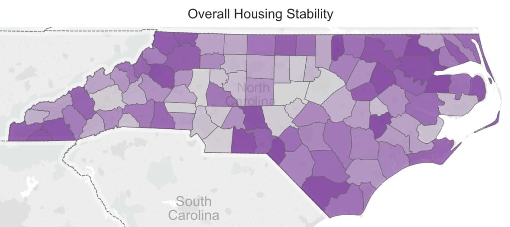
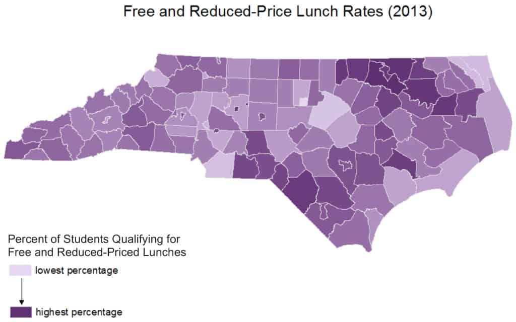
Finally, I combined the stability and instability maps to create an overall housing stability map.3 If I theorized correctly, there would be a connection between this map and some of the other maps I created of education and education-related data in the past. As I started to look at the patterns, I noticed that the map bore a striking resemblance to my map of free and reduced-price lunch from the FRL/CEP features a few months back, meaning that housing stability appears to track with our most commonly-used measure of student poverty. Though there is not a perfect 1:1 relationship, it is hard to deny that the two maps resemble one another.
Compare and Contrast: Housing Stability Rankings by county with Free and Reduced‐Price Lunch Rates (FRL) by school district
So why is this important, why should we care, and why am I interested? For me, it goes back to looking at education challenges from an interdisciplinary perspective. As education researchers, practitioners, lawmakers, and stakeholders, we need to understand that we can’t look only within our field to fully understand and then attempt to solve the problems that our schools face. There is rarely one fix to an education problem, and education is rarely the only solution to other problems. We need to approach partnerships by asking “How does my work impact not only those in my field, but also those in other fields?” In the case of this month’s maps, this interdisciplinary approach helps to expand our understanding not just of where poverty is concentrated but also of what poverty means in the context of a child’s life. Combining knowledge from different disciplines can help us to arrive at more sophisticated understandings of the impacts on children of broad concepts like poverty.
Can we solve problems across fields by changing the way we frame them?
The more I dive into the field, the more certain I am that the answers to the problems we face in education will be interdisciplinary. Stay tuned. Next month’s CIM topic will take a look at another issue in a similar way, but until then, share your thoughts with us below in the comments section or on Facebook and Twitter.
About the author