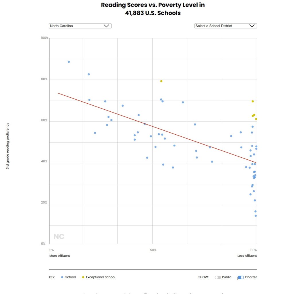
Chad Aldeman and The 74 recently released a new data set, including all 115 districts as well as charter schools in North Carolina, and an interactive tool with an invitation to dig in.
“North Carolina has a relatively large number of schools where 100% of students qualify for free- and reduced-price lunch,” says Aldeman. “Partly as a result of those schools clustered on the right side of the graph, North Carolina has one of the weaker relationships between poverty and reading outcomes compared to other states.”
Take a look at the interactive tool below to see what he means.
On the graph, the y-axis is reading proficiency and the x-axis is poverty rates.
The drop down on the right lets you see the data by district. At the bottom, you can select to isolate charters. A yellow dot identifies which schools are exceptional.
Other notes from the researchers:
As you hover over each dot, you’ll see the school’s actual versus expected literacy rate, based on the percentage of its students who qualify for free- and reduced-price lunch.
Exceptional schools are in the top 5% of their state in terms of outscoring their expected reading proficiency.
The red diagonal line in each graph is called the “best fit” line. The closer the dots are to the line, the stronger the correlation between a school’s poverty level and its reading proficiency rate.
The researchers focused on third-grade proficiency scores because, while not determinative, they “provide a strong indication of the path a student is on,” according to research by Dan Goldhaber, Malcolm Wolff, and Tim Daly.
The researchers relied on free- and reduced-price lunch data because it is familiar to readers, and it allowed the researchers to link poverty rates and reading scores for the same 2023-24 school year, with the goal of counting the actual students in a school building rather than relying on broader neighborhood measures.
Because different states use different exams, the researchers encourage readers to focus on within-state comparisons.
If your school is not on the list, the most likely reason is sample size.
— Chad Aldeman for The 74
Eamonn Fitzmaurice, The 74’s art and technology director, built this interactive tool.
District Name
All of those yellow dots are schools that are outscoring their expected reading proficiency, and that cluster of yellow dots shows schools from the far west to the far east of the state that are doing so even though their schoolwide poverty level is 95% or higher. This data also allows you to see, for example, that one of the schools where proficiency is just 3% is a school for newcomers to the country who don’t speak English.
The image below shows you the data for charter schools across North Carolina.

Aldeman hopes this project will kick off conversations in schools, districts, and states. Email me what you see in the data at mrash at ednc.org.
Editor’s Note: Readers have noticed that the high number of schools serving 100% of students who qualify for free- and reduced-price lunch is likely because of the community eligibility provision (CEP). School and district leaders note that many of these schools may not in fact be serving 100% of students who qualify. The data — especially the yellow dots — should be considered with that in mind. The researchers say there isn’t currently a way to “back that out using the federal data.”
Recommended reading


