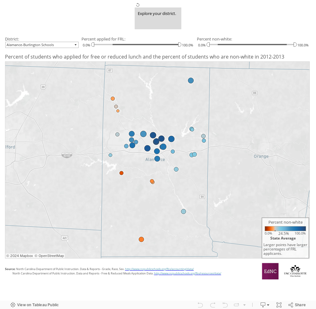
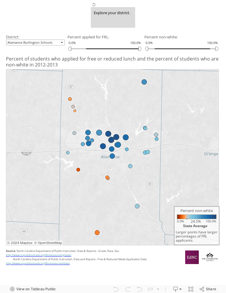
This week’s map looks at the intersection of two previous topics: student demographics and free and reduced lunch applicants.
The size of the circle represents the percent of students applying for free and reduced lunch- the larger the circle, the higher the percentage of students applying for free and reduced lunch. The color of the circle represents the percent of students who are non-white in the school. Schools in orange are below the state average (24.5 percent) in non-white percentage, and schools in blue are above. Use the dropdown menu to explore your district.
About the author