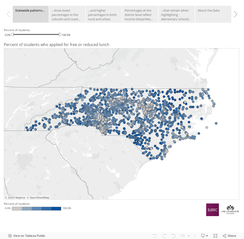
This week’s maps take another look at students applying for free and reduced lunch (FRL), now at the school level. Use the arrows above the map to guide you through the story, or jump around by clicking on a particular tab.
The first tab shows these figures for all schools across the state. Scroll over the school points to see the percentage of students who applied for free and reduced lunch at that school (and the district, for comparison). You can also filter the visible schools by the percentage of FRL applicants using the slider above the map.
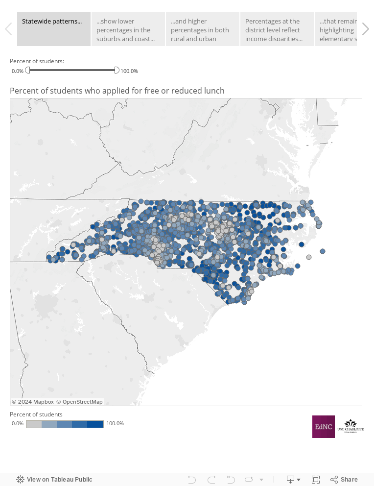
The map in the second tab focuses on schools with the lowest percentages of FRL applicants. This view reveals clusters of schools in and around the Triangle, Triad, and Charlotte areas where less than 20% of students applied for FRL, as well as small pockets of these schools along the coast, and dotted in the coastal plain and mountain regions.
The third tab examines the other end of the spectrum—schools where more than 80% of students applied for FRL. There are significantly more of these schools, and they are found throughout the state, in rural and urban areas. Several clusters of these schools appear in the state’s major urban areas, but can also be seen in the rural southeast, throughout the western mountain region, and all along the I-85 corridor stretching from Charlotte to Greensboro. These patterns are similar to those at the district level identified in last week’s map.
To zoom in on the schools in your district, move on to the fourth tab. Use the dropdown menu to select a district and highlight individual schools in the map and chart. Here, you can easily see the full range of FRL applicants by school and just how much these numbers can vary across a single district. In the map, the schools are color coded to indicate whether they are above the district average (in blue) or below (in orange), which makes the patterns all the more clear. Underneath the school points, the map shows per capita income by census block group, which aligns closely (although not exactly) with the schools’ FRL percentages. It should be noted that students living in the area around a school do not necessarily attend that school.
The fifth tab functions much like the fourth but focuses on elementary schools alone. Although students of any age can and do apply for free or reduced lunch, research has found that older students are less likely to participate in the FRL program due to the perceived stigma.12 For this reason, it is often more meaningful to look only at elementary schools, where the students are more likely to apply for the program, instead of comparing all schools within a district.
For data sources and definition, see the About the Data tab.
About the author