For the past several months on Consider It Mapped, we’ve featured publicly-funded alternatives to traditional public schools in North Carolina, including: charters, public choice (like magnets, early college high schools, and regional schools), and private schools that accept the state’s Opportunity Scholarship voucher. This month, we conclude our series on school choice by combining data on all of these options and considering questions such as: How has the number of schools that offer publicly-funded education alternatives changed over time? Are certain school districts offering more education alternatives than others? How many students choose publicly-funded alternatives to traditional public school?
Changes in choice options over time
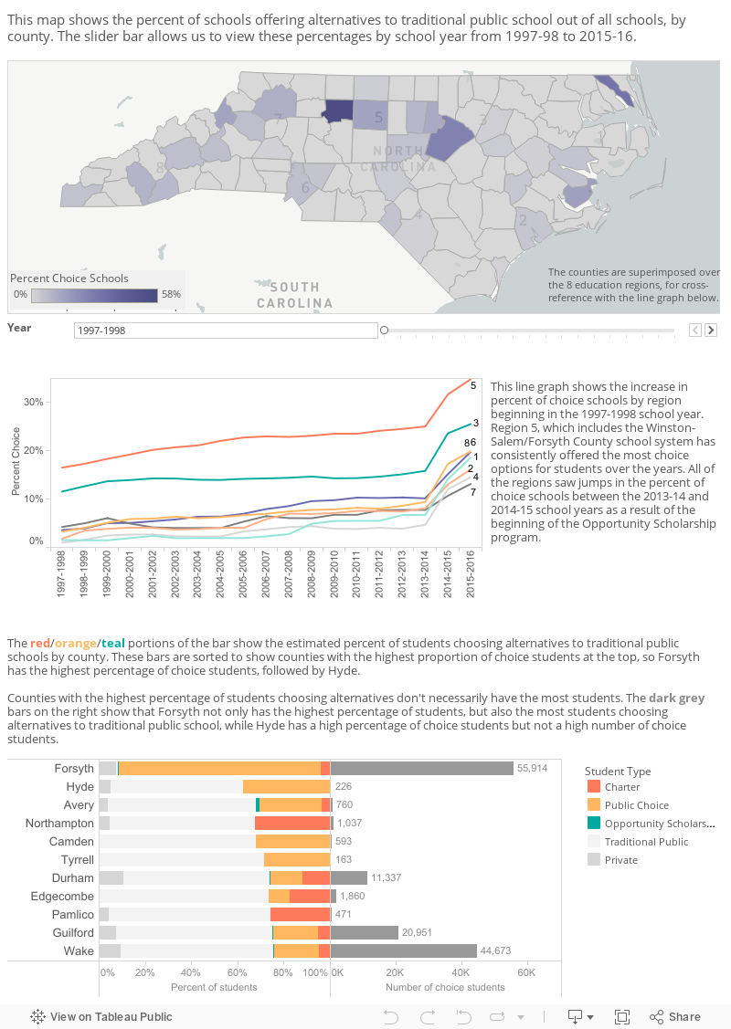
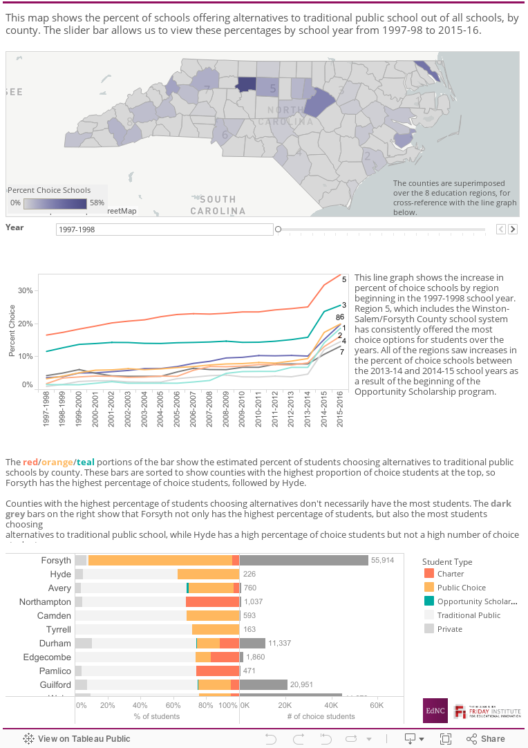
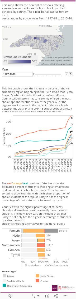
Let’s start by tackling our first two questions about the availability of publicly-funded schools of choice. Our map shows the percentage of choice schools by county,1 and the slider bar below allows us to view these percentages by school year from 1997-98 to 2015-16. Over time, many of the counties become darker shades of purple, indicating a growth in the number of schools of choice in those counties. In the first year of this map, only 30 counties had one or more publicly-funded schools of choice; today, 89 out of 100 counties have schools of choice.
Across all years, Forsyth County maintains the darkest shade of purple, because Winston-Salem/Forsyth County Schools has consistently offered the highest percentage of choice schools. The district’s “Schools of Choice” plan, implemented in the mid-1990s, broadened education options for all students. For more information about this plan, see the Consider It Mapped feature about public choice, linked above.
While many counties show increases across the entire timeframe, the noticeable shift statewide between 2013-14 and 2014-15 is largely attributable to the introduction of the Opportunity Scholarship program, which opened an entirely new category of choice school. The impact of the Opportunity Scholarship program is easier to see in the line graph below the map, which shows the percentage of schools that offer alternatives to traditional public school out of all schools within a region. The increase in percentage of schools is evident in all regions from the 2013-14 to 2014-15 school years. For more information about this program, see the Consider It Mapped feature about Opportunity Scholarships, linked above.
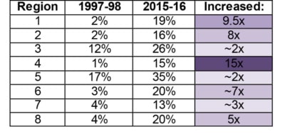
At the regional level, the percentage of schools that offer publicly-funded alternatives to traditional public schools has increased in each region since the 1997-98 school year. Region 5, which includes Winston-Salem/Forsyth County Schools, has the largest percentage of traditional alternatives in the state, and that percentage increased by a factor of about two between the 1997-98 and 2015-16 school years, going from 17 percent to 35 percent. The fastest growth in choice options for this time period was in Region 4, in which the percentage of traditional alternatives rose from 1 percent to 15 percent. The following table shows increases by region:
Changes in the population of students exercising choice options
So, how many students choose alternatives to traditional public school overall? Clicking on a county in the map above will select that county’s corresponding bar in the chart below the line graph. The left side of the chart shows estimated2 percentages of all charter, district choice, Opportunity Scholarship, traditional public, and private school students by county for the 2015-16 school year. The bar chart is sorted by the highest estimated percentage of students who have chosen publicly-funded alternatives to traditional public school. In many cases, students opting into charter schools and other public choice alternatives make up the bulk of the public choice students, but these programs are older and more established. Because we know from last month’s feature about the Opportunity Scholarships that the General Assembly has approved ongoing expansion of the program, it will be interesting to see how the proportions of students in each choice category shift as a response in the coming years.
You may notice that some of the counties with the highest percentage of choice students are also counties with small populations. It’s important to note that counties with the highest percentages of choice students may not have the highest number of choice students. Bars on the right side of the chart show the number of choice students beside the student percentages, showing that many of the counties that have a high percentage of students who opt into choice options actually have a small to moderate number of students overall. For instance, in Hyde and Avery counties, 30 percent to 40 percent of students opt into choice options but these percentages account for less than 1,000 students combined. Forsyth County takes the number one spot on both sides of the bar chart, with both the highest proportion of students choosing publicly-funded alternatives to public school and the highest number of students in any county statewide. Again, this can likely be attributed to Winston-Salem/Forsyth County Schools’ commitment to their “Schools of Choice Plan.”
Summing up
At a high level, our exploration of school choice over the past several months has revealed that the menu of options is growing and changing in many counties, but also that growth and change has been more prevalent in some counties than in others. Counties like Forsyth, Durham, and Guilford have been pioneers in the realm of school choice for a large number of students, so as we seek to learn more about the impact of choice expansion, we should look to experts in these counties and others who have gained knowledge and experience over a long period of time for their insights. That said, there is also plenty we can learn about the importance of and relative demand for school choice from counties with few or even none of the aforementioned public options.
Parents, teachers, administrators, and policy makers: We’d love to keep the conversation about school choice going. If you have experience with any of the options we’ve discussed this summer, please reach out to us on social media or in the comments section on EdNC.org.
About the author