
This data summary analyzes trends in the NC District Responses to COVID-19 School Closures database completed on June 5, 2020, which is an update of the database first published on April 23, 2020. In developing the database, researchers first searched for districts’ publicly posted distance learning plans on district and school websites and social media pages. As a follow-up to the initial research, EdNC sent a survey to North Carolina school districts in an effort to fill in gaps and gain context for district and school responses. This database thus reflects publicly posted distance learning plans as well as districts’ self-reported responses to COVID-19 school closures. Note that the database shows what districts report they are doing, but it may not reflect actual implementation.
In an effort to illuminate statewide trends and explore equity gaps among North Carolina districts’ responses to COVID-19 school closures, the Public Impact data team broke out each indicator in the database along seven district characteristics, as shown in the table below: percentage of students of color, district wealth, district size, percentage of students receiving free and reduced-price lunch, county computer and internet access, percentage of students who are in special education, and percentage of students who are English language learners.
For each characteristic, researchers placed districts into four quartiles, with quartile 1 representing the most advantaged condition and quartile 4 the least advantaged condition. The trends captured in this data summary reflect the gaps between quartile 1 and quartile 4 districts. In deciding which data points to highlight here, researchers identified those that represent the largest gaps between quartiles, as well as trends related to current education debates on equity occurring in North Carolina.
| District characteristic | Source |
| Percentage of students of color | Student enrollment data via National Center for Education Statistics (NCES) |
| District wealth | A calculation based on county-level property tax, taxable property, and per-capita income to determine qualifying counties for NC’s Low Wealth Supplement |
| District size | Student enrollment data via NCES |
| Percentage of students receiving free and reduced-price lunch | Student enrollment data via NCES |
| Computer access | County-level census data via U.S. Bureau of Census’s American Community Survey |
| Internet access | County-level census data via American Community Survey |
| Percentage of students who are in special education | Student enrollment data via NC Department of Public Instruction (NC DPI) |
| Percentage of students who are English language learners | Student enrollment data via NC DPI |
Takeaways and statewide trends
Bright spots:
- Device distribution and English language learners — Districts with the highest concentration of English language learners are 2.7 times more likely to distribute devices to all students as compared with districts with the lowest concentration of English language learners (41% vs. 15%).
- Family support & English language learners — Districts with the highest concentration of English language learners are 1.3 times more likely to train families on virtual platforms than districts with the lowest concentration of English language learners (75% vs. 58%).
Percentage of students of color:
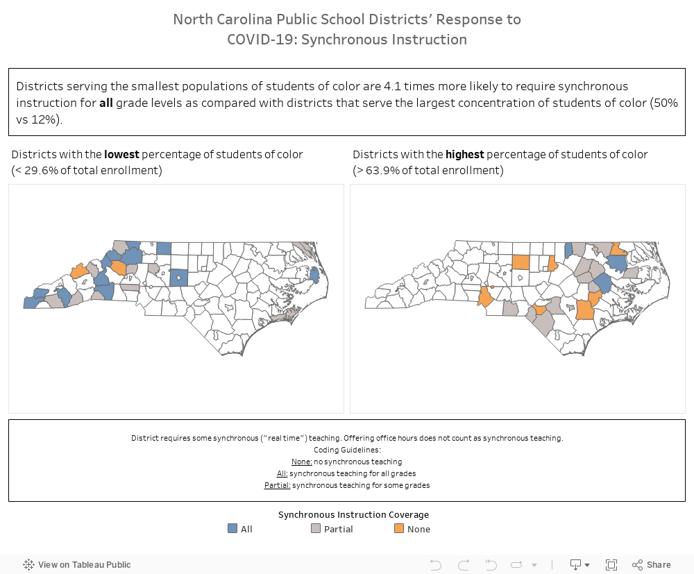
- Synchronous instruction — Districts serving the smallest populations of students of color are 4.1 times more likely to require synchronous instruction for all grade levels as compared with districts that serve the largest concentration of student of color (50% vs. 12%).
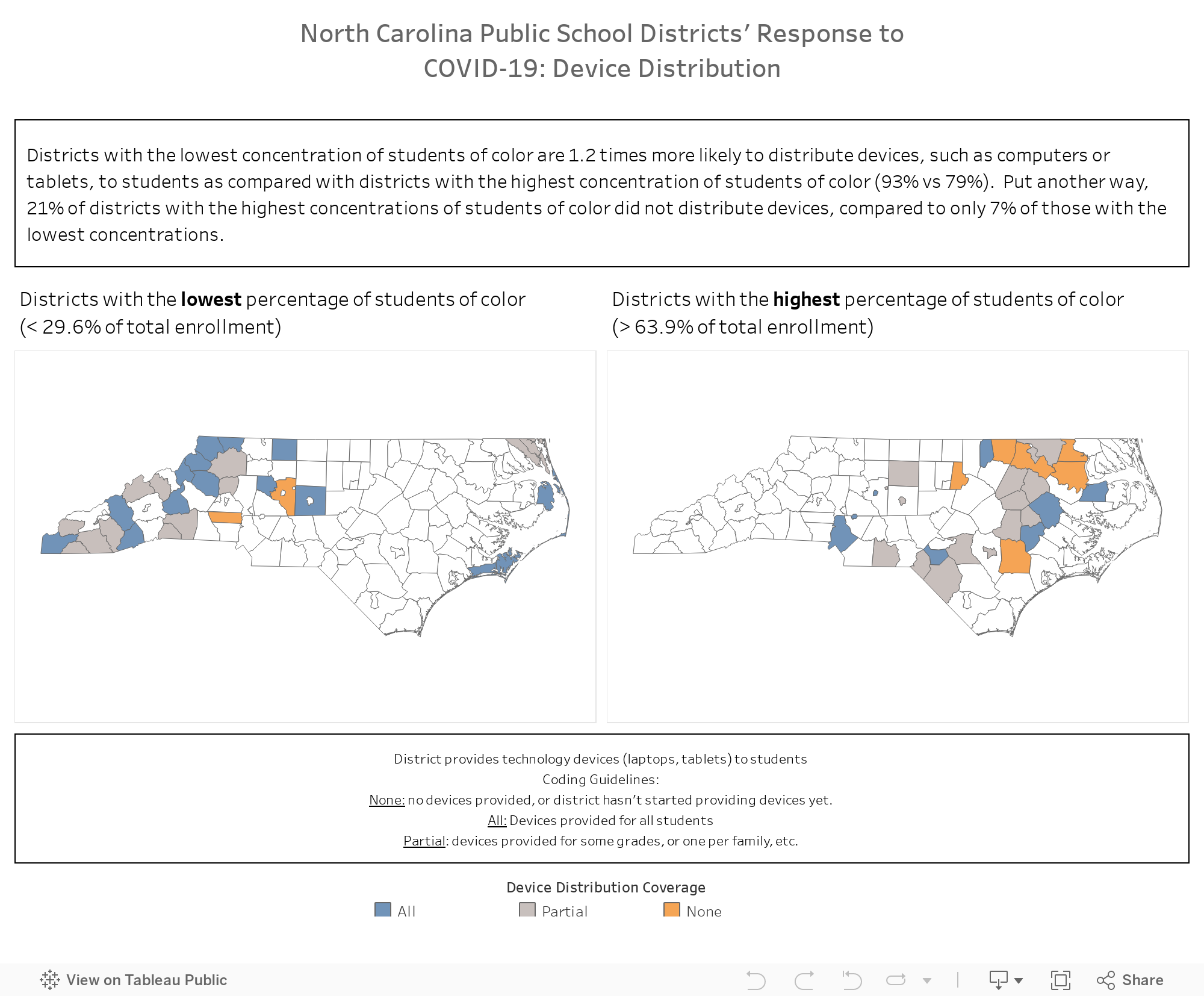
- Device distribution — Districts with the lowest concentration of students of color are 1.2 times more likely to distribute devices, such as computers or tablets, to students as compared with districts with the highest concentration of students of color (93% vs. 79%). Put another way, 21% of districts with the highest concentrations of students of color did not distribute devices, compared with only 7% of those with the lowest concentrations.
- Family training — Districts with the lowest concentration of students of color are 1.3 times more likely to offer training to families on using virtual platforms as compared with districts with the highest concentration of students of color (72% vs. 56%).
- District delegates decision-making to schools — Districts that serve the lowest percentage of students of color are 1.6 times more likely to delegate full curriculum and instruction decision-making to individual schools during school closures (85% vs. 52%).
District wealth:
- Synchronous instruction — Districts in the highest quartile for wealth are 1.5 times more likely to provide all grades with synchronous instruction as compared with districts in the lowest wealth quartile (41% vs. 27%).
- Device distribution — Districts in the highest quartile for wealth are 3 times more likely to distribute devices, such as computers or tablets, to all students as compared with districts in the lowest quartile for wealth (57% vs. 19%).
- Wi-Fi access — Districts in the highest quartile for wealth are 6.6 times more likely to distribute home-based hot spots as compared with districts in the lowest quartile for wealth (33% vs. 5%).
District size:
- Gaps — Smaller districts, with lower student enrollment, are 1.7 times more likely to have missing data than larger districts (17% vs. 10%).
- Family training — Larger districts with more students are 1.3 times more likely to offer training to families on using virtual platforms as compared with smaller districts (89% vs. 68%).
Percentage of students receiving free or reduced-price lunch:
- Device distribution — Districts with the lowest concentration of students receiving free and reduced-price lunch are 1.9 times more likely to distribute devices to all students than districts with the highest concentration (48% vs. 25%).
- Family training — Districts with the lowest concentration of students receiving free or reduced-price lunch are 1.3 times more likely to offer training to families on using virtual platforms as compared with districts with the highest concentration of students receiving free or reduced-price lunch (79% vs. 60%).
Computer and internet access:
- Computer access — Districts with the highest access to computers at home, according to county-level census data, are 1.2 times more likely to distribute devices to students as compared with districts with the lowest computer access at home (97% vs. 79%).
- Internet access — Compared with districts with the highest internet access at home, districts with the lowest access to the internet at home are 2.7 times more likely to establish community-based hot spots (63% vs. 23%) but are one-fourth as likely to distribute home-based hot spots (10% vs. 40%).
Special populations:
- Device distribution & English language learners — Districts with the highest concentration of English language learners are 2.7 times more likely to distribute devices to all students as compared with districts with the lowest concentration of English language learners (41% vs. 15%).
- Family support & English language learners — Districts with the highest concentration of English language learners are 1.3 times more likely to train families on virtual platforms than districts with the lowest concentration of English language learners (75% vs. 58%).