As schools reopen for fall classes, much about this school year looks different for students and educators. Amid the ongoing COVID-19 pandemic, school districts and parents have had to make difficult decisions regarding where and how students will engage in their coursework this year.
Understanding the risk that COVID-19 poses to local communities has been vital to making those decisions. Many districts have worked with state and local agencies to bring together important information, such as active cases and the resulting deaths, in order to better understand the COVID-19 pandemic in context.
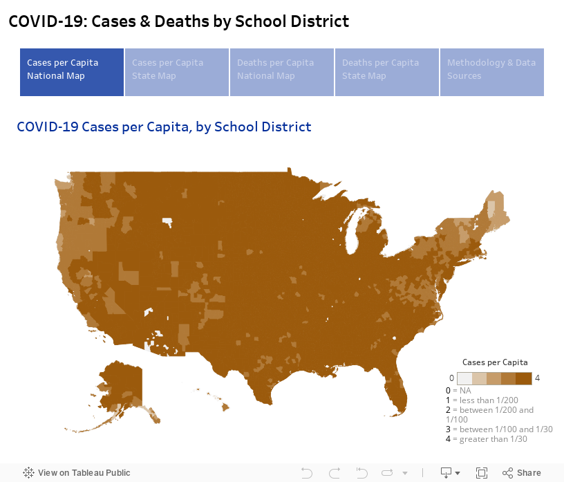
The Hunt Institute’s COVID-19 map compiles this information by school district into an interactive tool that will empower districts, schools, parents, and policymakers with crucial information (thanks to the New York Times releasing COVID-19 data publicly). Separate maps illustrate cases per capita and deaths per capita. The inclusion of death rates is meant to help account for variations in testing across states and regions.
The evidence is clear that COVID-19 has disproportionately impacted individuals of color and this map incorporates demographic and socioeconomic indicators, including the race and ethnicity of the student population as well as the rate of students who receive free or reduced-price lunch. The COVID-19 map helps us to understand which populations are being most affected by the pandemic, and thus where policy efforts might best be targeted.
For example, a legislator could use this tool to see which school districts in their jurisdiction are being most acutely impacted by COVID-19, or a state leader might use this map to quickly compare districts across the state. Similarly, advocates could use this map to analyze state-specific information on the correlation between districts with high populations of students of color and those most affected by the pandemic.
Our COVID-19 map can be viewed on both the national and state levels, with a gradated coloration denoting districts most impacted by COVID-19. As the map illustrates, both rural and urban districts have been severely impacted, with high rates of deaths per capita showing up in both urban centers and highly rural districts.
In order to view information for a particular school district, simply move your cursor over the area that you are interested in and a pop-up box will display all relevant COVID-19 and district data, including the number of new cases in the last 14 days. Tabs at the top of the page will help navigate you to different maps, such as cases and deaths per capita at the state and national levels.
The map will be updated multiple times each week to continually track the spread of COVID-19 throughout the country. We hope that this is a useful resource for you. Should you have questions, comments, or suggestions, please don’t hesitate to reach out to us.
We would also like to acknowledge the work of Wesley Morris, current Ph.D. student in education policy at UNC-Chapel Hill, in compiling, merging, and cleaning the data for this map.